HOPI Holding – House of Lovebrands
![]()
We have rebranded the HOPI Holding logo and we intend to enter the next decade in a new coat.
This year we celebrate the 30th anniversary of HOPI and we are going to enter the next decade with a clearly defined vision and plans.
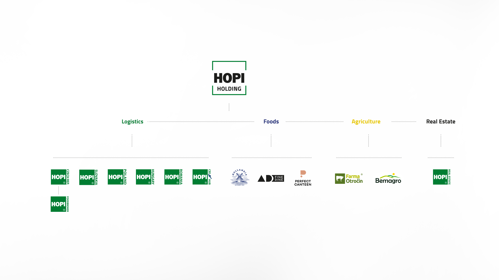
HOPI Holding is no longer just a logistics company. It is manufacturing, it is agriculture, it is gastronomy. There is so much that proves us why the logo we inherited from the logistics branch is no longer enough.
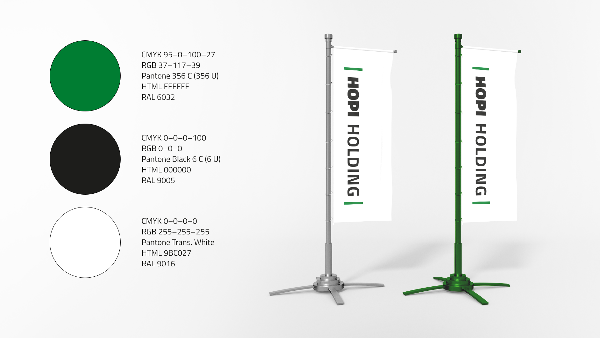
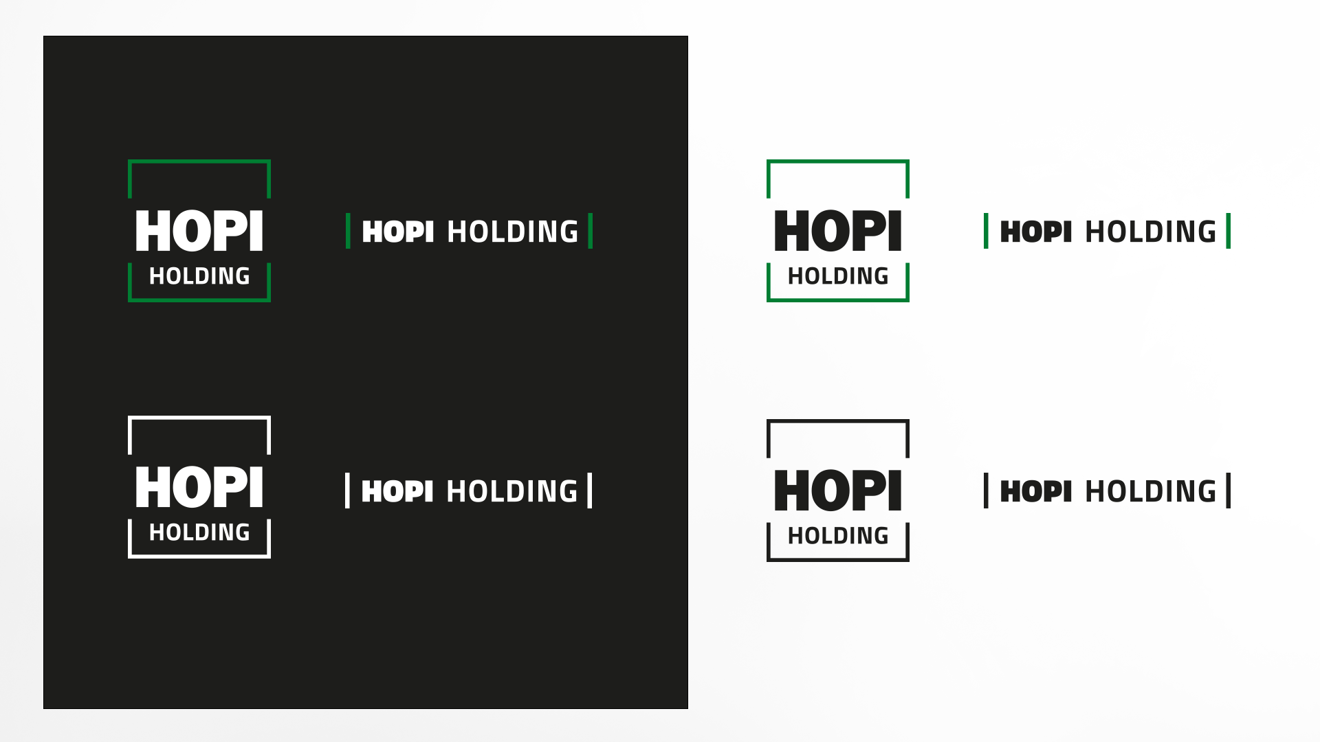
We went through a profound evolution to modernize the logo. We kept the traditional elements, such as the square shape, the green colour and the significant HOPI sign. This visually detaches the holding company from the logistics division, but also pays tribute to it.
The new face of the holding includes an inverted, horizontal and black and white version of the logo, making the identity more adaptable and the rules of use clearer.